Milan: A City In Style
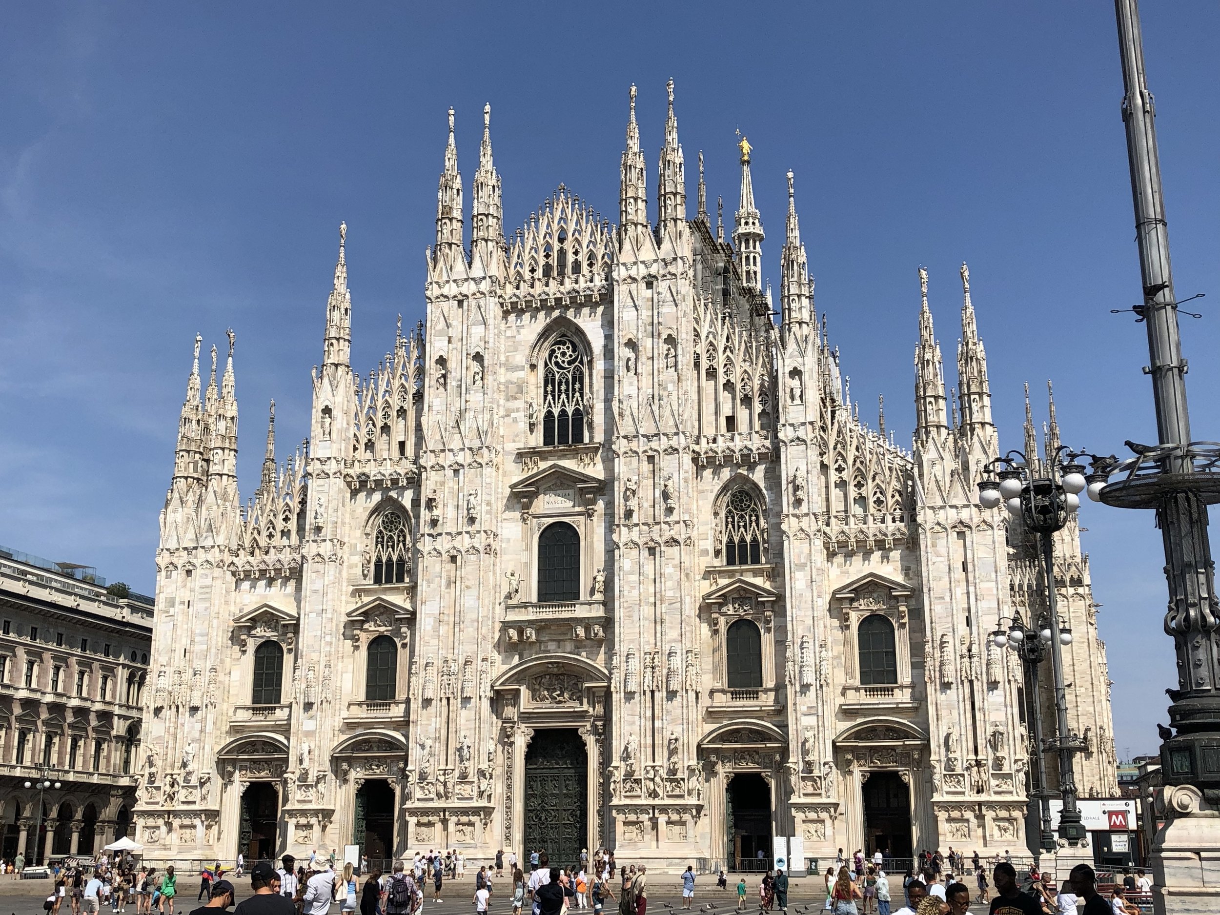
Il Duomo, arguably Milan’s most famous (and transit-accessible) cathedral
Ciao! Ace here.
For my last European travel blog post of four, I am capping off my trip with some lessons learned in the fashion capital of the world Milan. An epicenter of design, from architecture to fashion the city boasts great examples of what quality design looks like at a multitude of scales. I spent some time walking the streets of Milan to distill down some of the qualities of the city that make it a beloved home to millions and create a place where a high level of design is the standard and not outside the norm.
Here are three great lessons to learn from a city that is always in fashion.
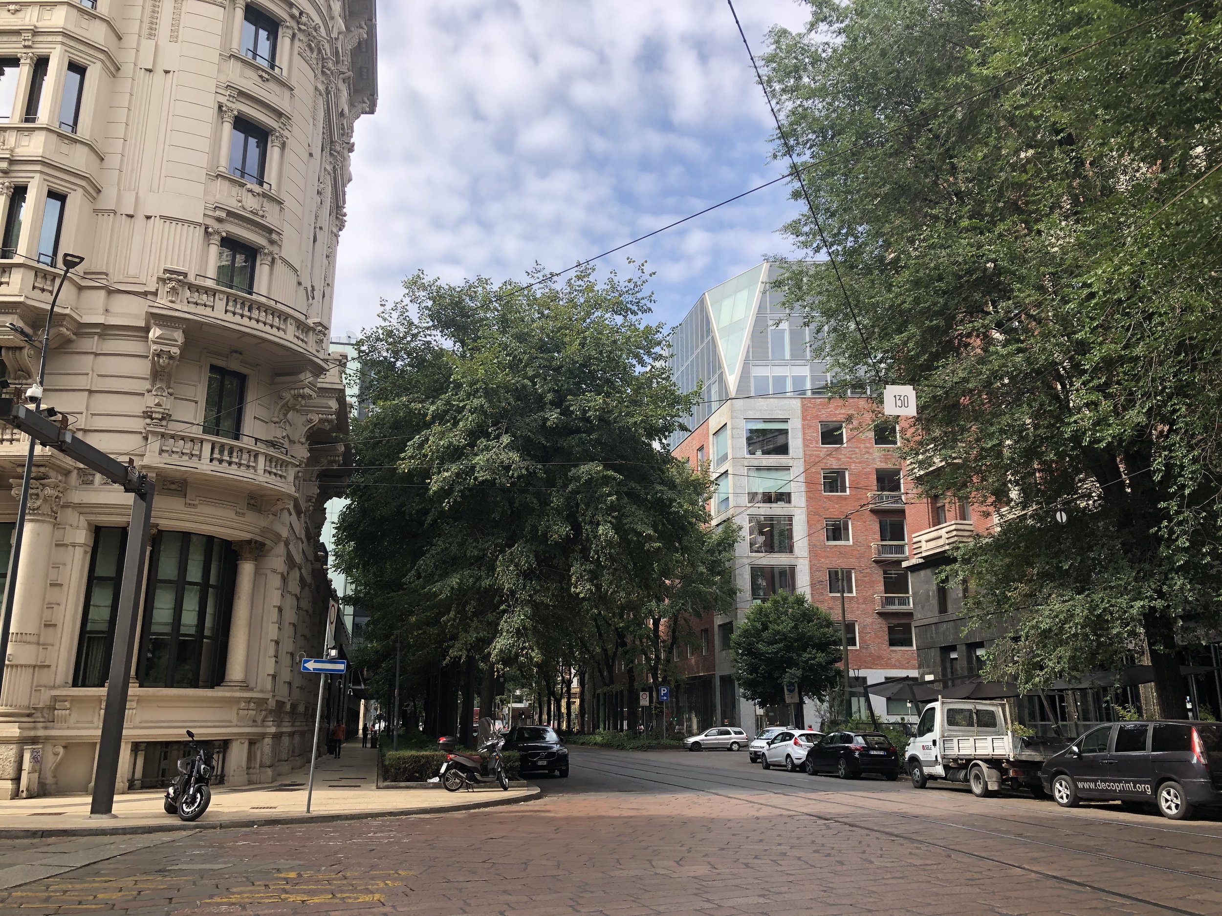
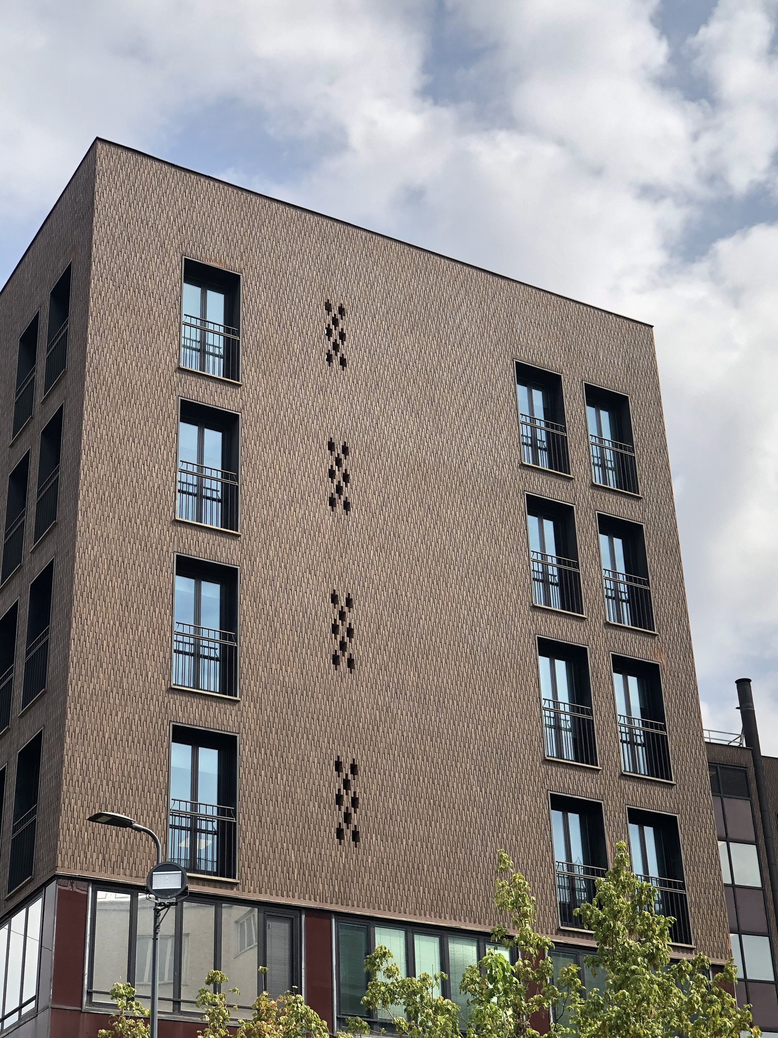
A fairly nice building…
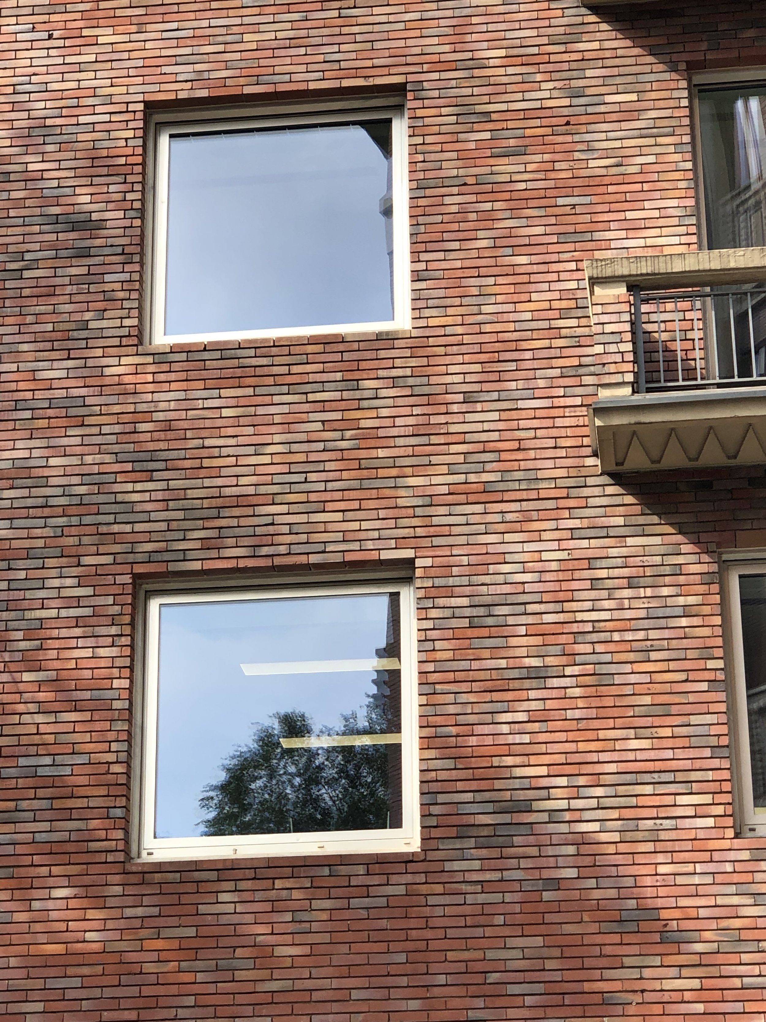
…is even more intriguing up close with excellent window detailing and beautiful break variation.
Good Details Make Great Design
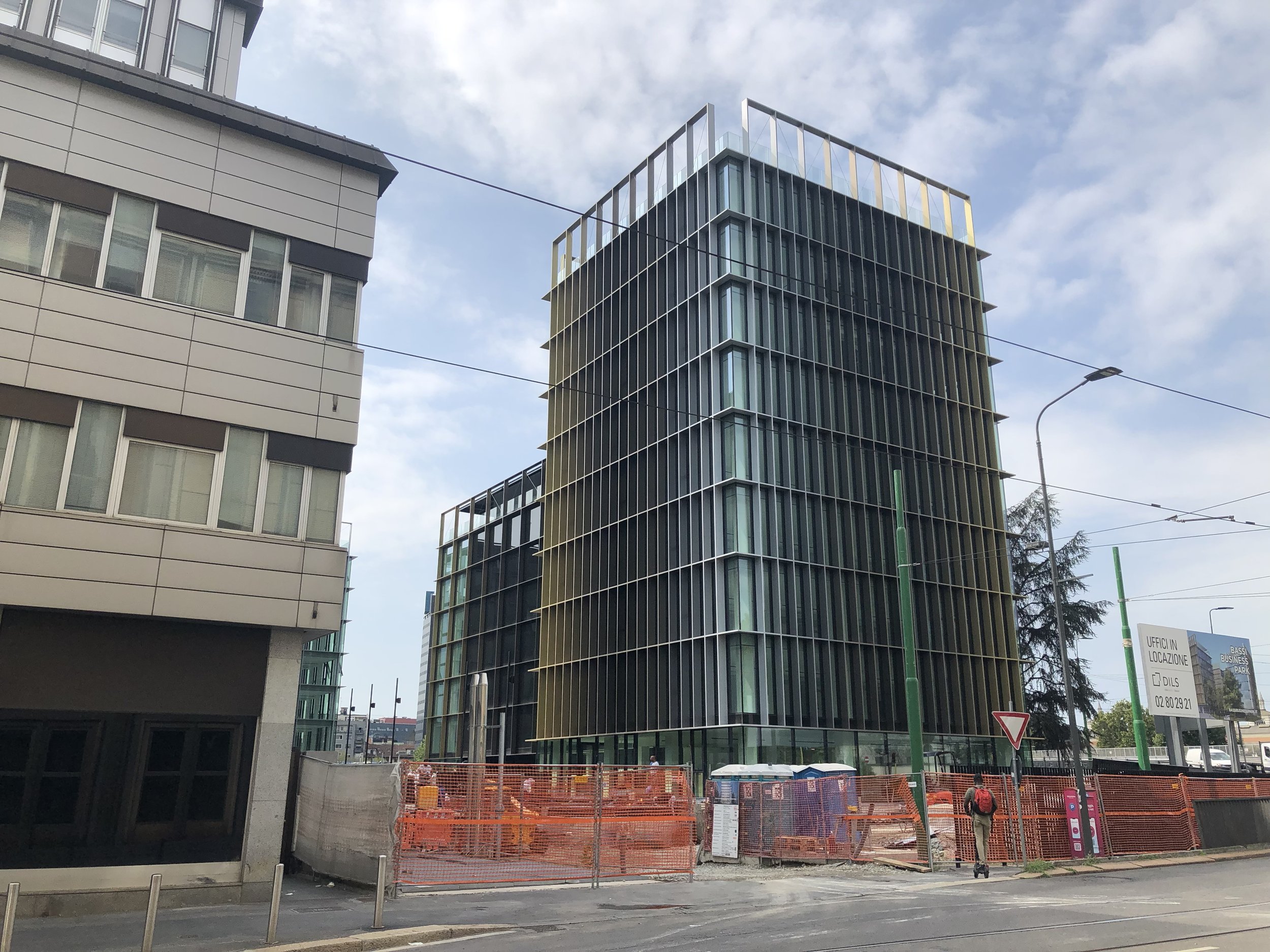
What could be a fairly standard office design is taken to another level by an ombre effect
What will strike you in Milan is that when it comes to building design, a lot of buildings are fairly simple boxes. What makes them extraordinary is the quality of the design - specifically in the details used.
Whether it be a variation of brick; the scale of a pattern applied across the face of a building; or something as striking as an ombre of color, the fact that the buildings are extremely simple in their overall shape makes it so that these details are front and center.
There Is Power in the Patio
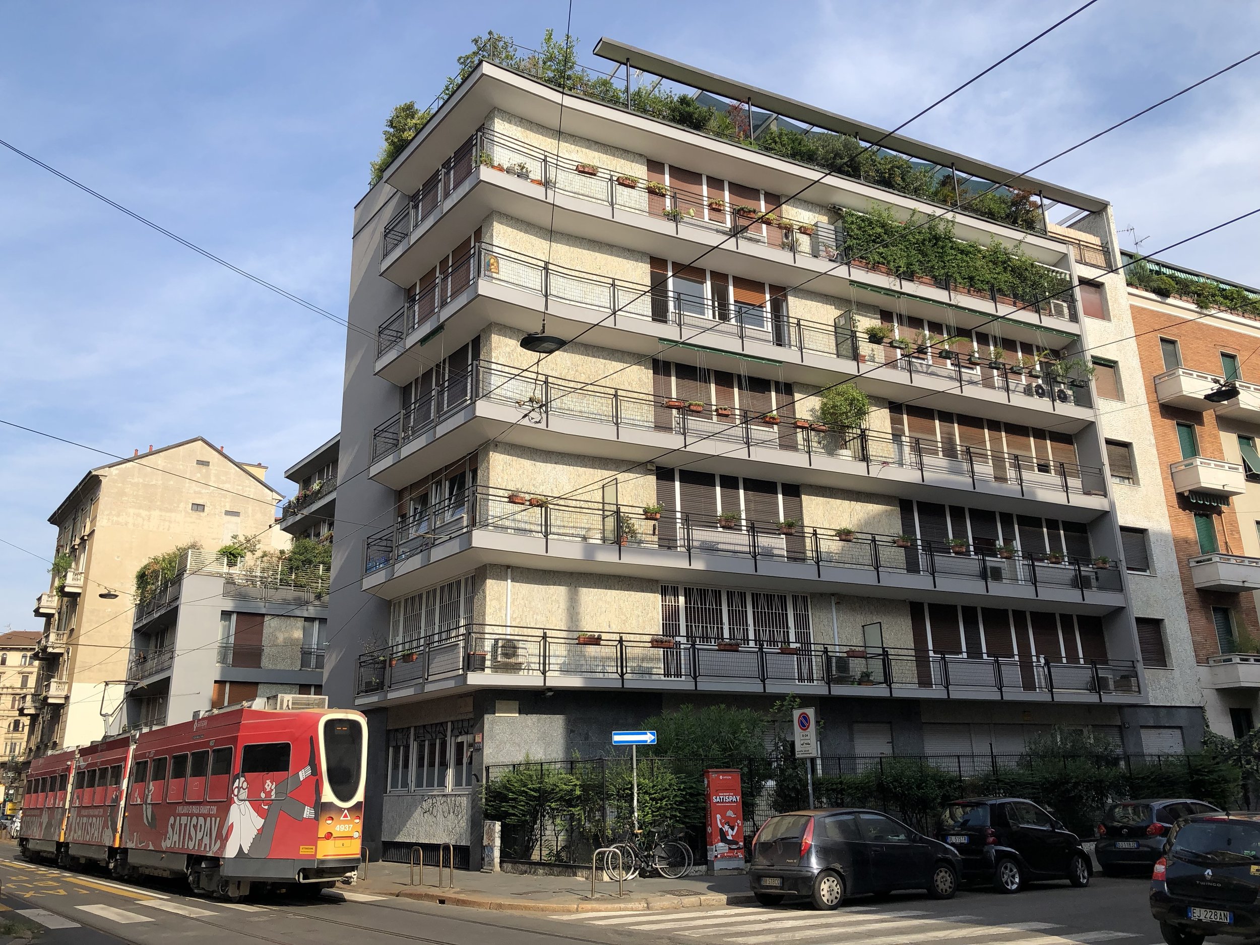
“Urban Improv” in Action
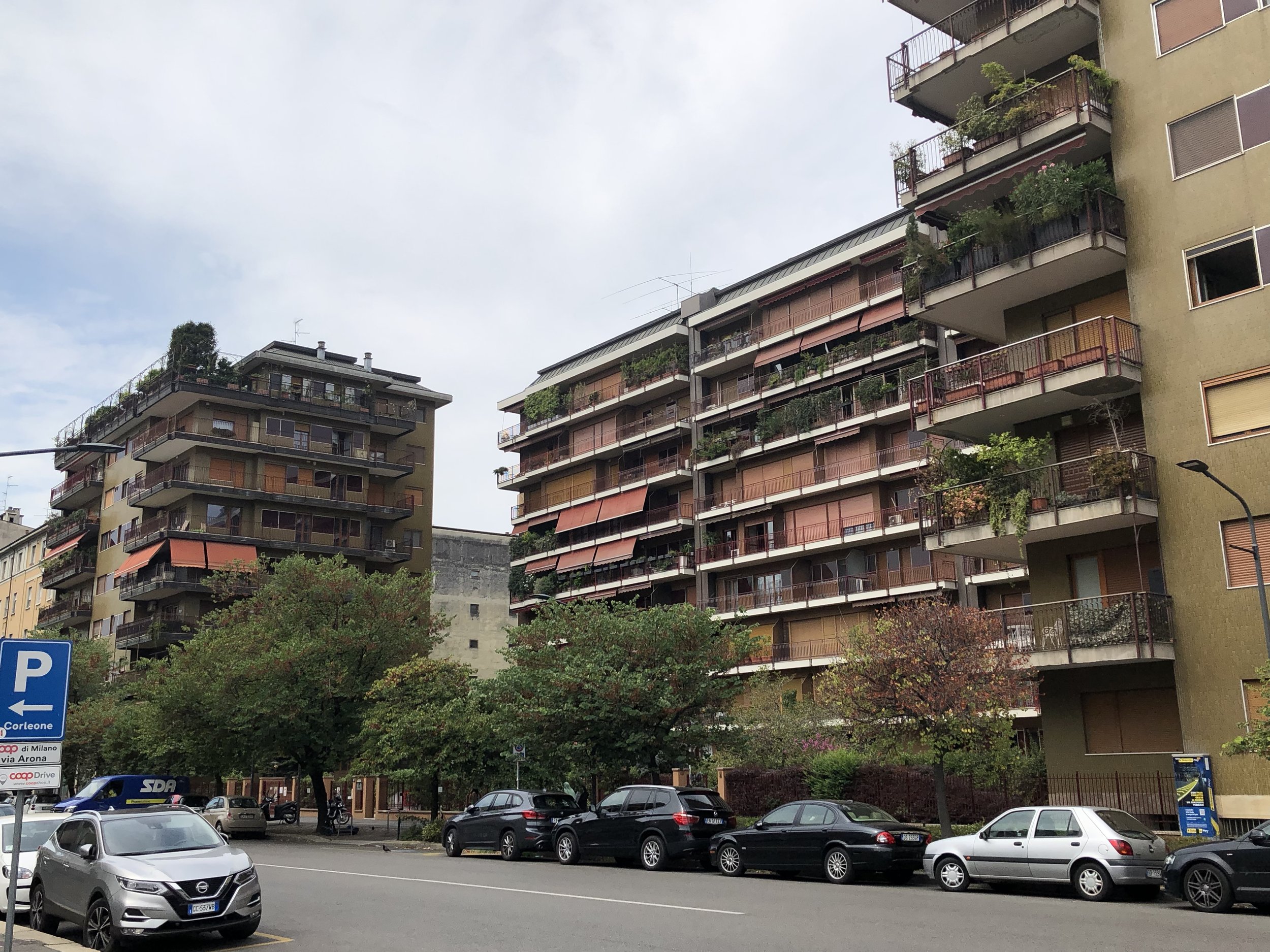
What makes a city as dense as Milan (around 20,000 people per square mile or nearly twice as dense as Seattle) still feel comfortable is the availability of outdoor space, including just outside your own window. The patios that belong to most of the residential buildings in the city create both an extension to one’s own house while providing space for some “urban improv” to occur. By “urban improv,” what I mean is that it allows for some customization of the exterior of the building that takes a building that could otherwise look very plain and uninteresting on the outside to something that really catches your eye.
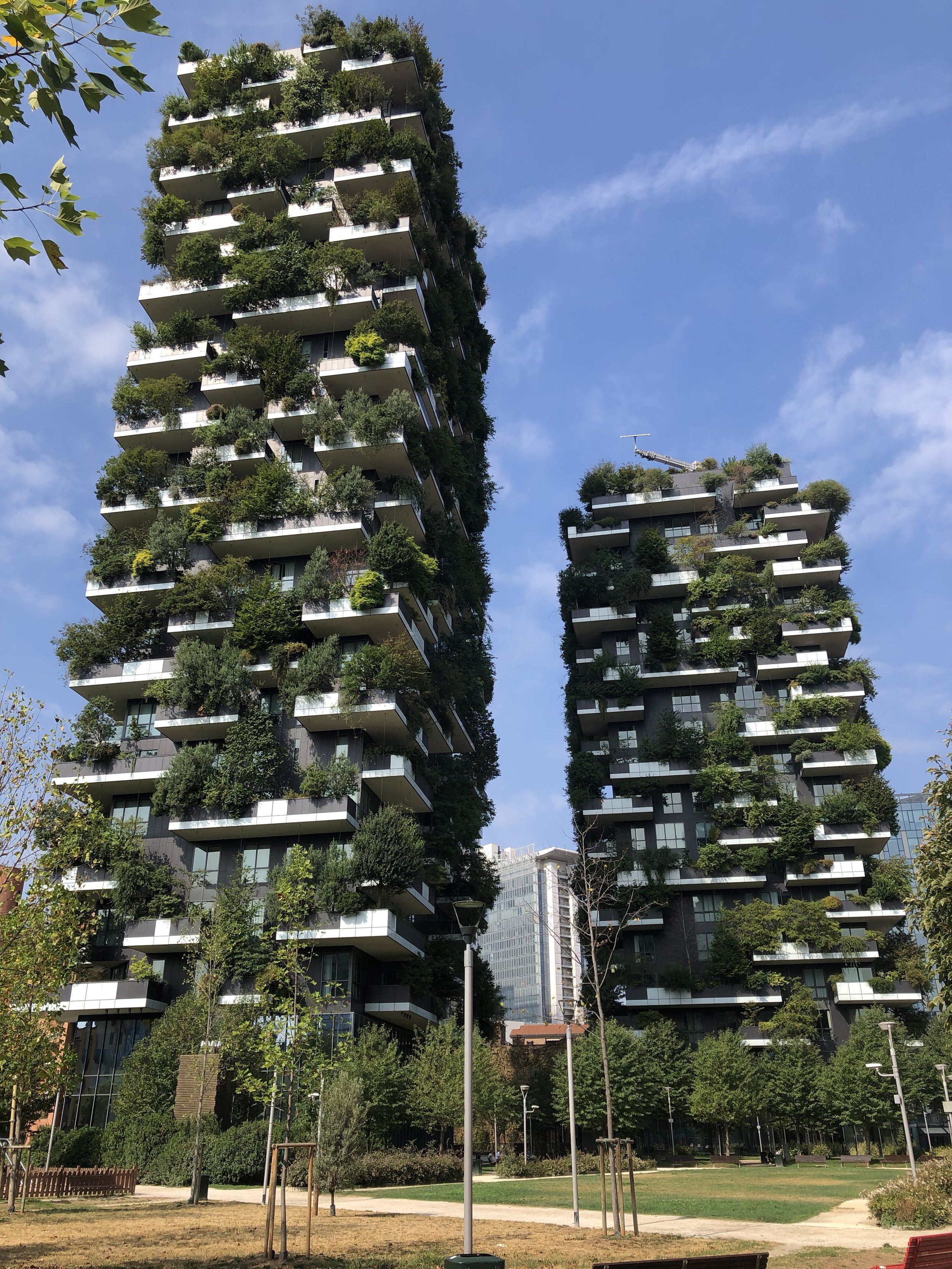
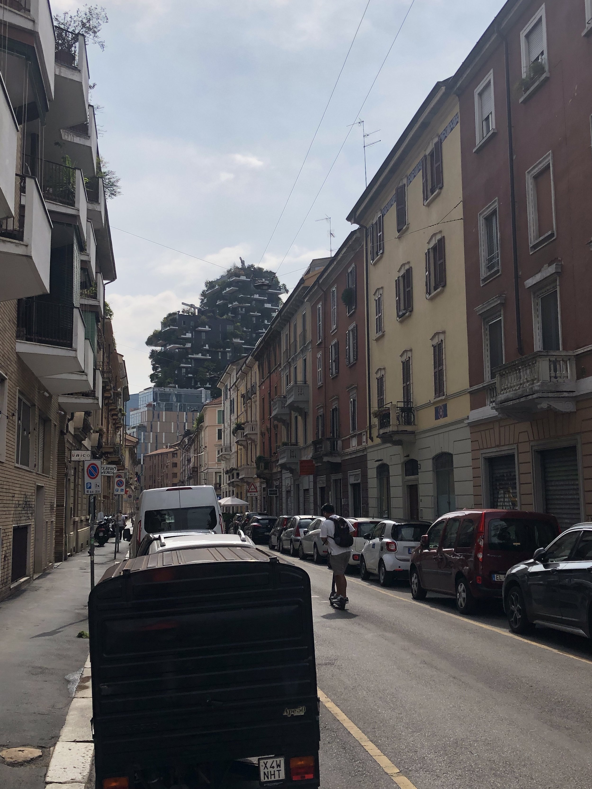
Bosco Verticale
You see a variety of plants and other décor on these patios, and with some boasting exterior shades as well, no two buildings look alike. The plants also add levels of green to each apartment, something that is taken to the extreme with the building “Bosco Verticale” by Stefano Boeri Architetti.
This is a concept that I generally thought was interesting when I had first seen it in photos, but in the context of a city that provides patios of green for almost every building, taking this idea to the nth degree by upgrading the structure to provide for not just smaller plants but for larger trees as well makes total sense and truly sold me on this unique novelty.
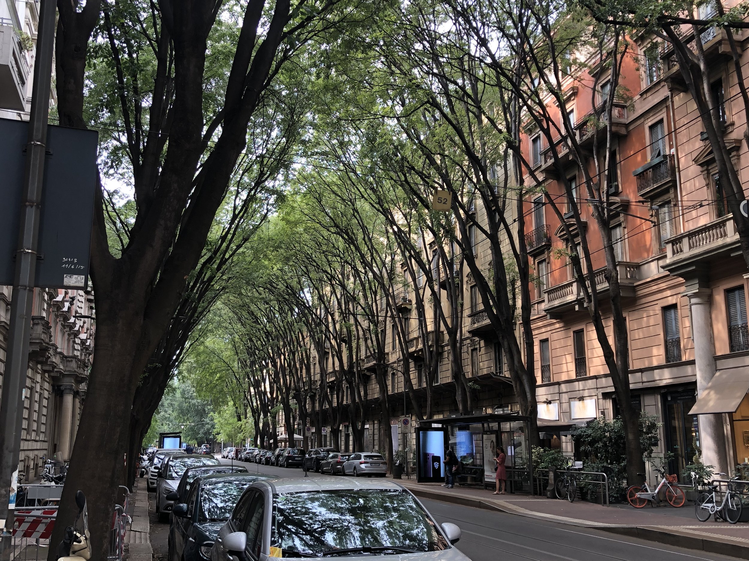
Trees Make All The Difference
Not far from a place with many trees is a street without any
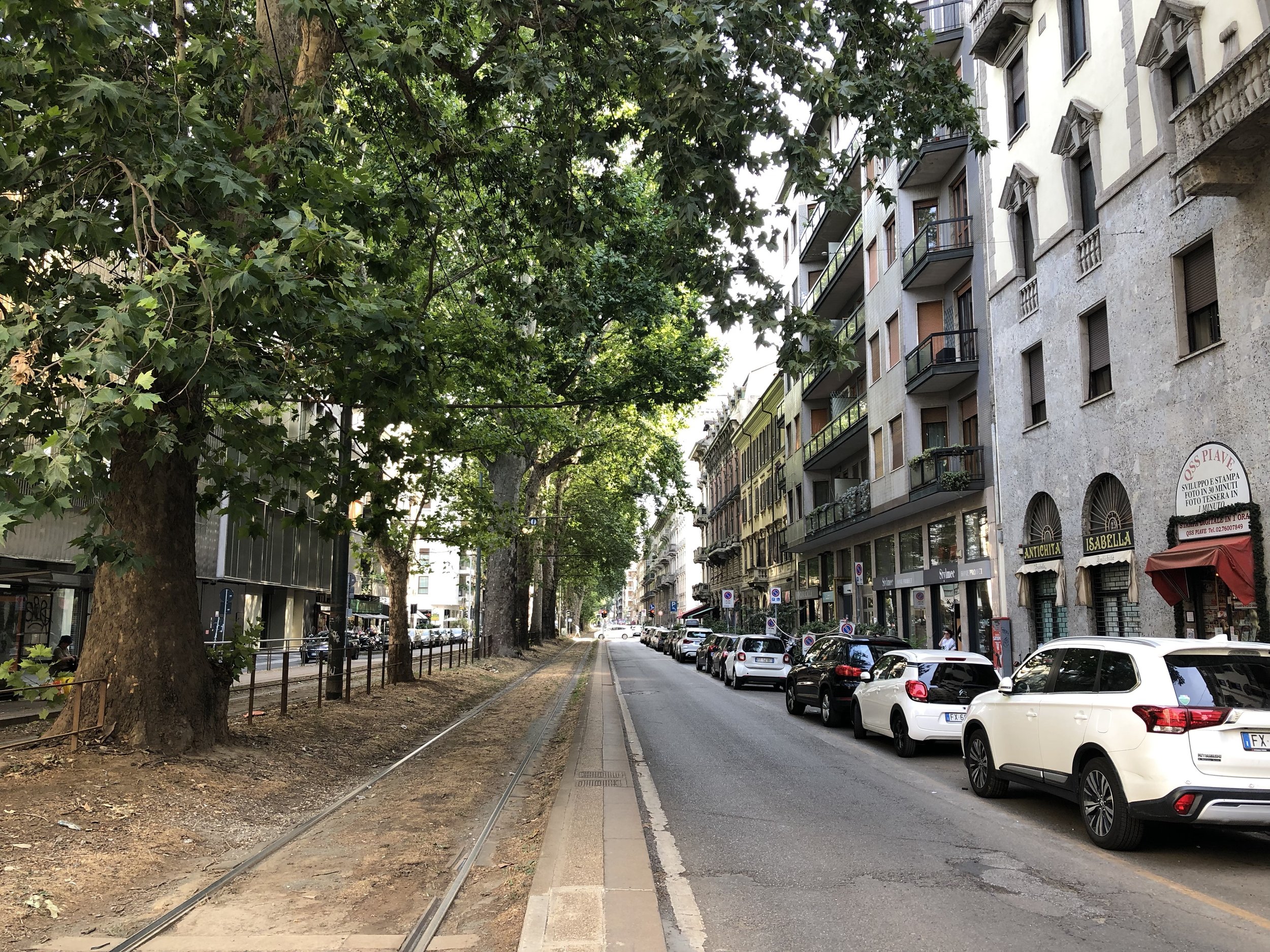
Tree-lined tram line. Adoro!
Speaking of trees, something that was quite striking was how much trees played a factor in how much I enjoyed a street. This is something that is generally discussed as understood in urban design, however there were a number of times where I would walk a few blocks from a place where there were no trees to a tree-lined canopy of a boulevard and the difference could not be more striking. Even on streets that were doing all the other urban design pieces correctly—narrow curb-to-curb space, wide sidewalks, etc.—the streets that had trees were much more enjoyable to walk down. Trees at tram stops also meant waiting for the next train to arrive was that much more enjoyable away from the heat of the July midday sun.
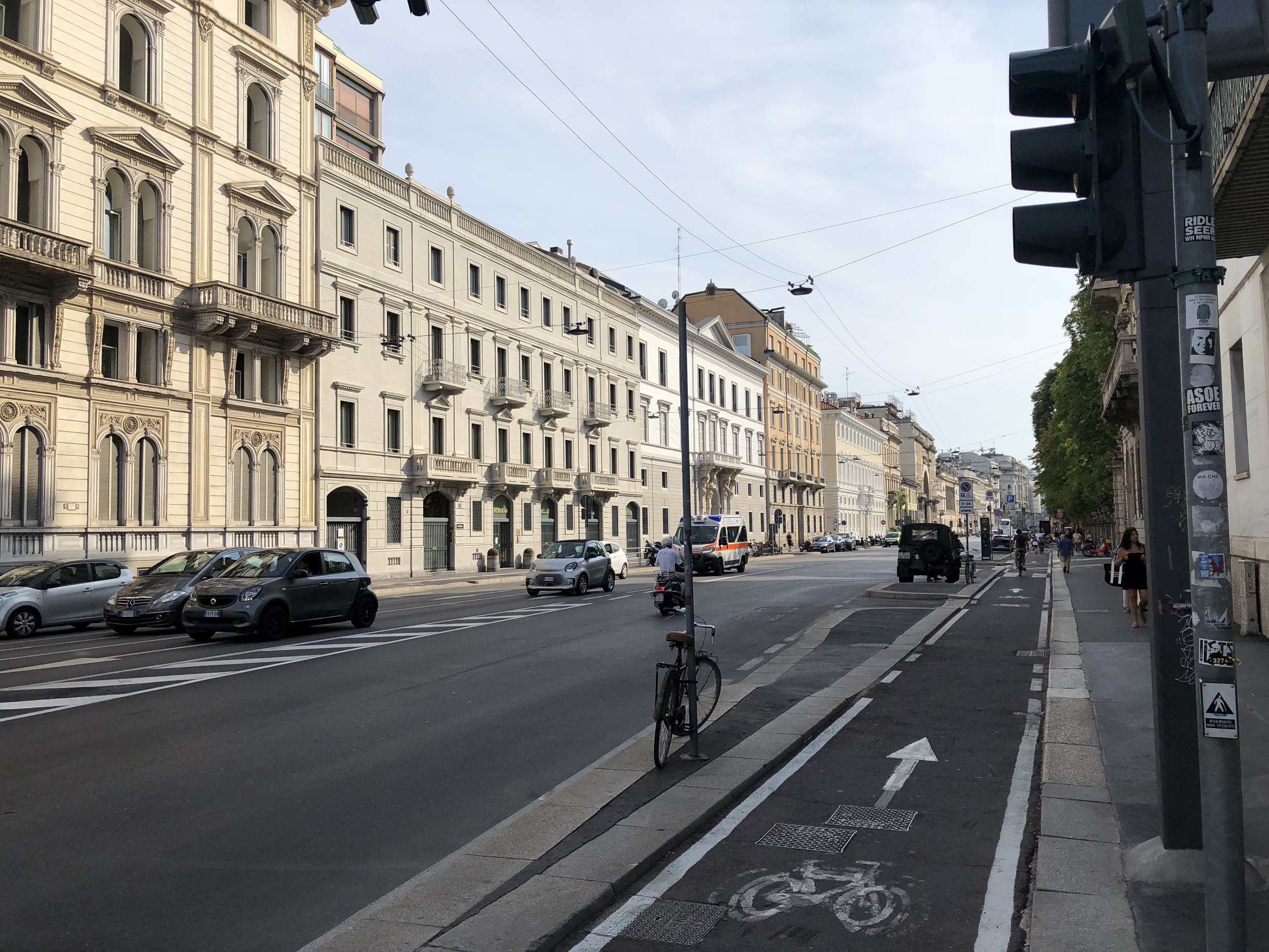
A Milanese avenue that is too wide for its own good
There’s Always Room For Improvement
The Cambio Plan (image via Dezeen)
There are many things that Milan does well, however it is a place that is still very car dependent and provides a lot of space for automobiles, so in some ways not unlike a lot of its American counterparts. That being said, just like the fashion industry it houses, Milan is a city that is ever changing and evolving. A great example of this is the “Cambio” (change in Italian) Bike Network, a proposal to create a new system of protected bike lanes across the Milanese metropolis by 2035.
This is how the city stays at the forefront of what is best for both their inhabitants and for the world at large. Milan is a city that knows good design and stays at the forefront of it in all disciplines.

